Padovani Arquitetos
Padovani is an international studio based in Brazil that was created by the architect Lucas Padovani. The modern style made the studio gain notoriety in the national market and paved the way to do projects in Portugal and the USA. When these opportunities arose, Lucas felt the need to redesign the studio brand to a more globalized concept and approached us to create the brand's new identity.
Padovani é um estúdio internacional localizado no Brasil que foi criado pelo arquiteto Lucas Padovani. O estilo moderno fez o estúdio ganhar notoriedade no mercado nacional e abriu caminho para fazer projetos em Portugal e EUA. Quando essas oportunidades surgiram, Lucas sentiu a necessidade de redesenhar a marca do estúdio para um conceito mais globalizado e se aproximou de nós para criar a nova identidade da marca.
Branding, Web
Branding, Web
Branding, Web
Branding, Web
Branding, Web

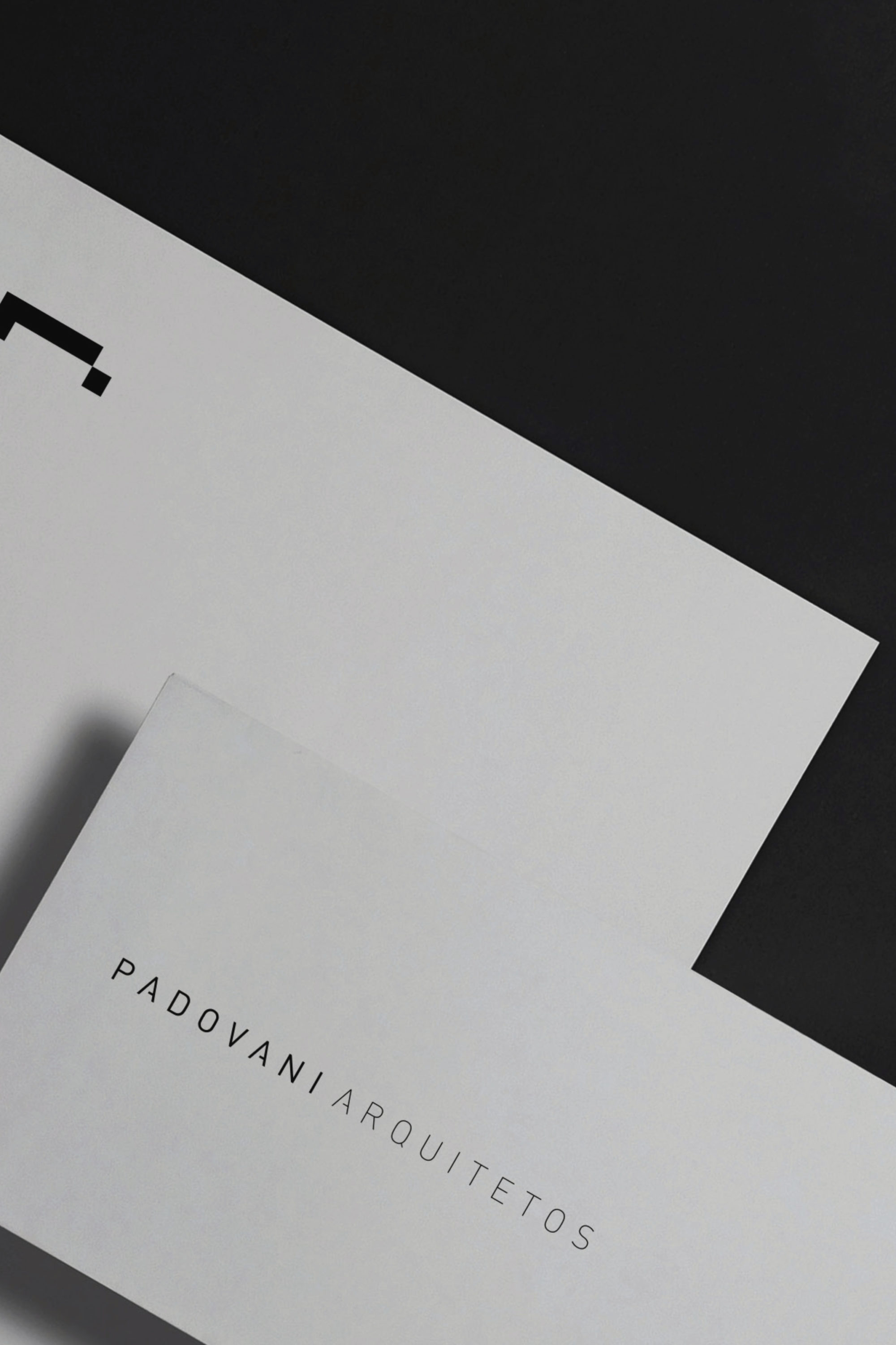


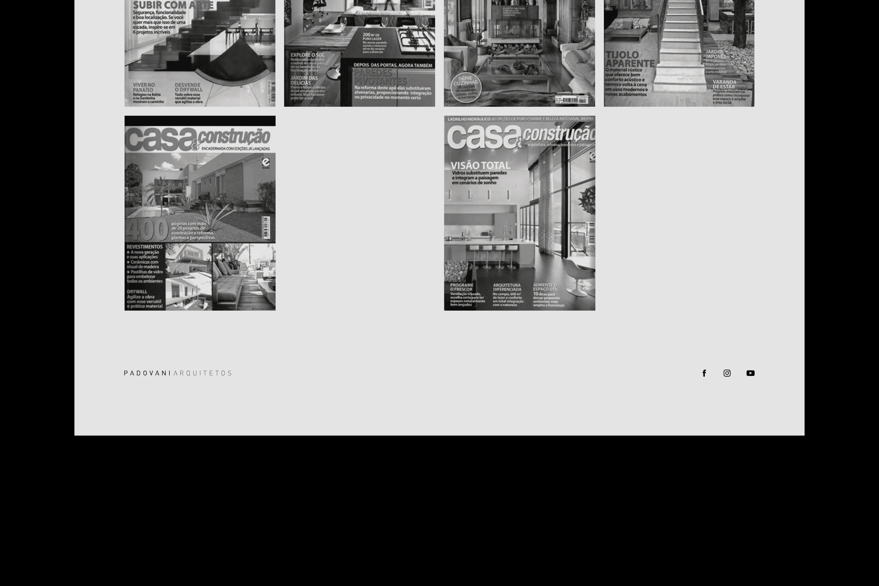
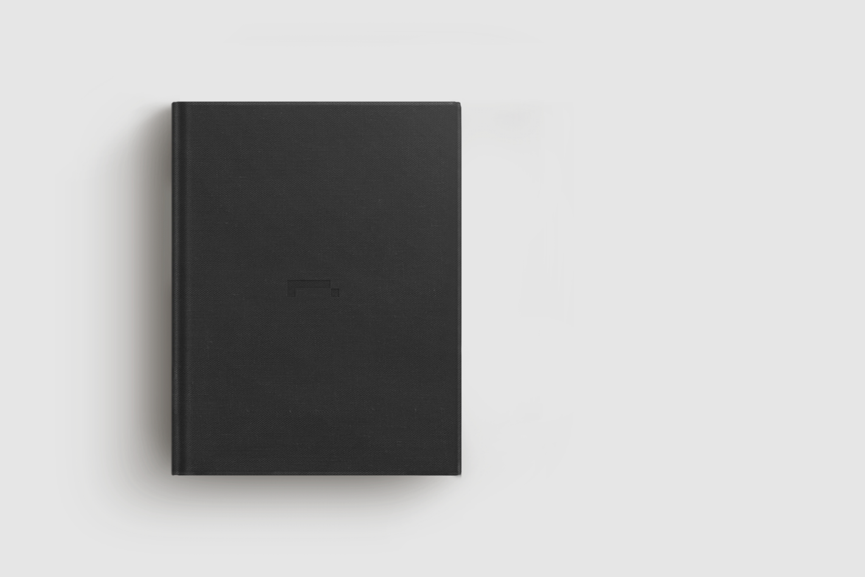
The logo is a celebration of their portfolio. We study deeply the projects of the studio until finding the ideal form in Guaicá House, one of the most prestigious cases that they have done. The architecture of the house allowed to sketch some icons reducing the lines of the silhouette until arriving at a minimum number of elements that made it identifiable. In addition to graphically reproducing this project, we wanted to make the icon style applicable to other shapes, so that new designs gained their own identity within the brand atmosphere.
We chose the icon made in two shapes. The icon was designed with simplicity to arrive at the most minimalist aesthetics possible.
O logo é uma celebração ao próprio portfolio. Nós estudamos profundamente os projetos do estúdio até encontrar a forma ideal na Guaicá House, um dos cases mais prestigiados que eles já fizeram. A arquitetura da casa Guaicá permitiu esboçar alguns ícones reduzindo as linhas da silhueta até chegar em um número mínimo de elementos que a tornassem identificável. Além de reproduzir graficamente este projeto, nós queríamos tornar o estilo do ícone aplicável sobre outras formas para que novos projetos ganhassem uma identidade própria dentro da atmosfera da marca.
Nós escolhemos o ícone feito com duas formas porque ele sintetiza tudo o que o estúdio significa. O ícone foi desenhado com simplicidade para chegar na estética mais minimalista possível.
Icon creation
Icon creation
Icon creation
Icon creation
Icon creation


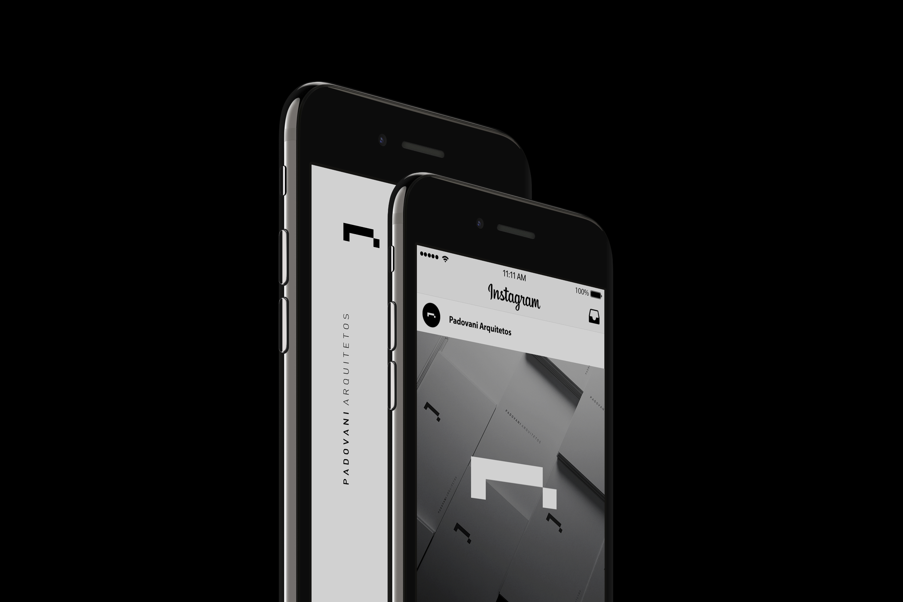
We chose a typeface inspired in DIN family to compose the logo and the colour palette reduced to black and white, which makes the brand sophisticated. The new identity of Padovani Arquitetos is the result of a look into the essence of the studio, an identity that is not limited to Brazil, instead, it elevates the brand with a timeless and minimalist aesthetic.
Selecionamos uma família tipográfica inspirada an família DIN para compor o logo e a paleta de cores reduzida ao preto e branco, que faz a marca sofisticada. A nova identidade do Padovani Arquitetos é o resultado de um olhar para dentro da própria essência do estúdio, uma identidade que não se limita ao Brasil, em vez disso, eleva a marca com uma estética minimalista e atemporal.
We selected the typeface DIN Next LT Pro to compose the logo and the colour palette reduced to black and white, which makes the brand sophisticated. The new identity of Padovani Arquitetos is the result of a look into the essence of the studio, an identity that is not limited to Brazil, instead, it elevates the brand with a timeless and minimalist aesthetic.
Selecionamos a família tipográfica DIN Next LT Pro para compor o logo e a paleta de cores reduzida ao preto e branco, que faz a marca sofisticada. A nova identidade do Padovani Arquitetos é o resultado de um olhar para dentro da própria essência do estúdio, uma identidade que não se limita ao Brasil, em vez disso, eleva a marca com uma estética minimalista e atemporal.