Equimetal Moenco
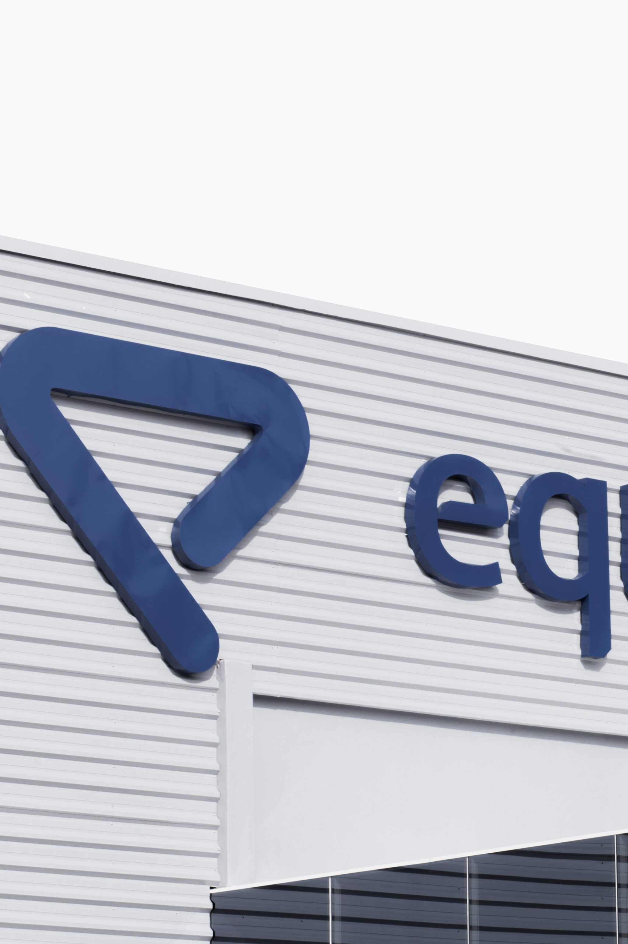
Based in Brazil, Equimetal Moenco is the result of the merger of two highly reputed companies in the metal structures market. After almost a year organizing the operational structure, the partners approached us to study how the merger would be presented, with a new brand name or uniting the two brands. As there was no wear and tear on the image, we decided to keep both as a compound name, introducing Equimetal Moenco.
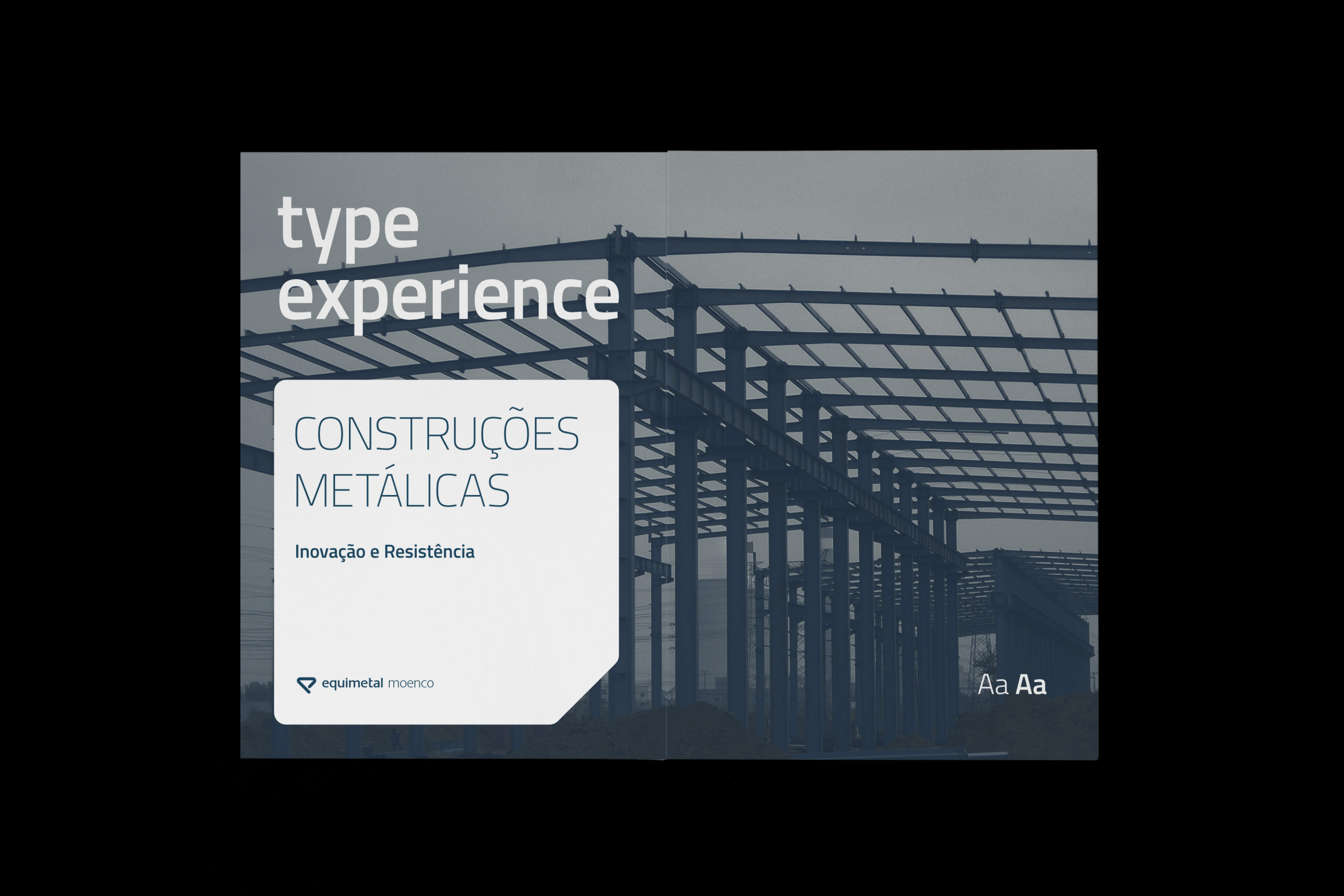
With the name defined, the creative process was oriented to reproduce graphically the segment of metallic structures and the corporate image under a new modern identity and adapted to the new moment of the company.
Localizada no Brasil, a Equimetal Moenco é o resultado da fusão de duas empresas bastante conceituadas no mercado de estruturas metálicas. Depois de quase um ano organizando a estrutura operacional, os sócios se aproximaram de nós para estudar a forma como a fusão seria apresentada, com um nome de marca novo ou unindo as duas marcas. Como não havia desgaste na imagem, decidimos por manter ambos como um nome composto, originando a Equimetal Moenco.
Com o nome definido, o processo criativo foi orientado para reproduzir graficamente o segmento de estruturas metálicas e a imagem corporativa sob uma nova identidade moderna e adequada para o novo momento da empresa.
Equimetal Moenco
Based in Brazil, Equimetal Moenco is the result of the merger of two highly reputed companies in the metal structures market. After almost a year organizing the operational structure, the partners approached us to study how the merger would be presented, with a new brand name or uniting the two brands. As there was no wear and tear on the image, we decided to keep both as a compound name, introducing Equimetal Moenco.
With the name defined, the creative process was oriented to reproduce graphically the segment of metallic structures and the corporate image under a new modern identity and adapted to the new moment of the company.
Localizada no Brasil, a Equimetal Moenco é o resultado da fusão de duas empresas bastante conceituadas no mercado de estruturas metálicas. Depois de quase um ano organizando a estrutura operacional, os sócios se aproximaram de nós para estudar a forma como a fusão seria apresentada, com um nome de marca novo ou unindo as duas marcas. Como não havia desgaste na imagem, decidimos por manter ambos como um nome composto, originando a Equimetal Moenco.
Com o nome definido, o processo criativo foi orientado para reproduzir graficamente o segmento de estruturas metálicas e a imagem corporativa sob uma nova identidade moderna e adequada para o novo momento da empresa.
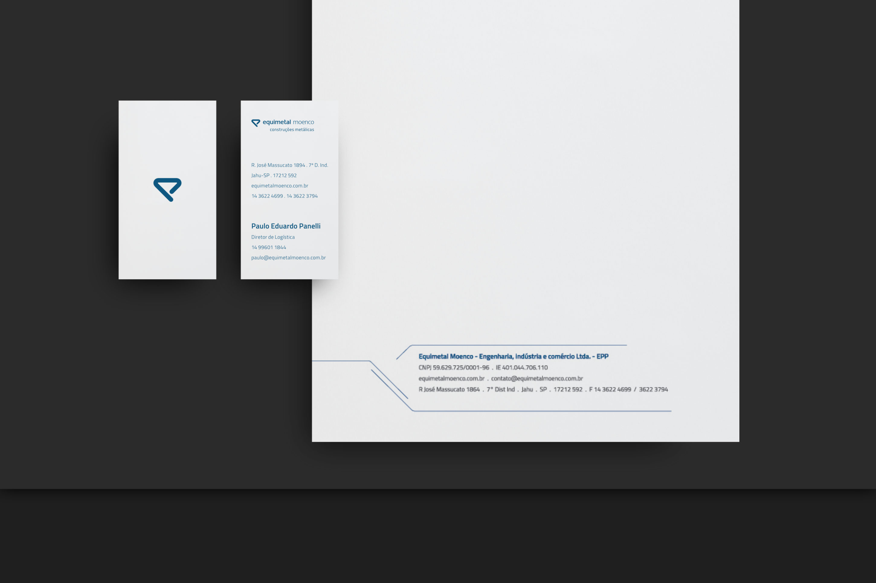
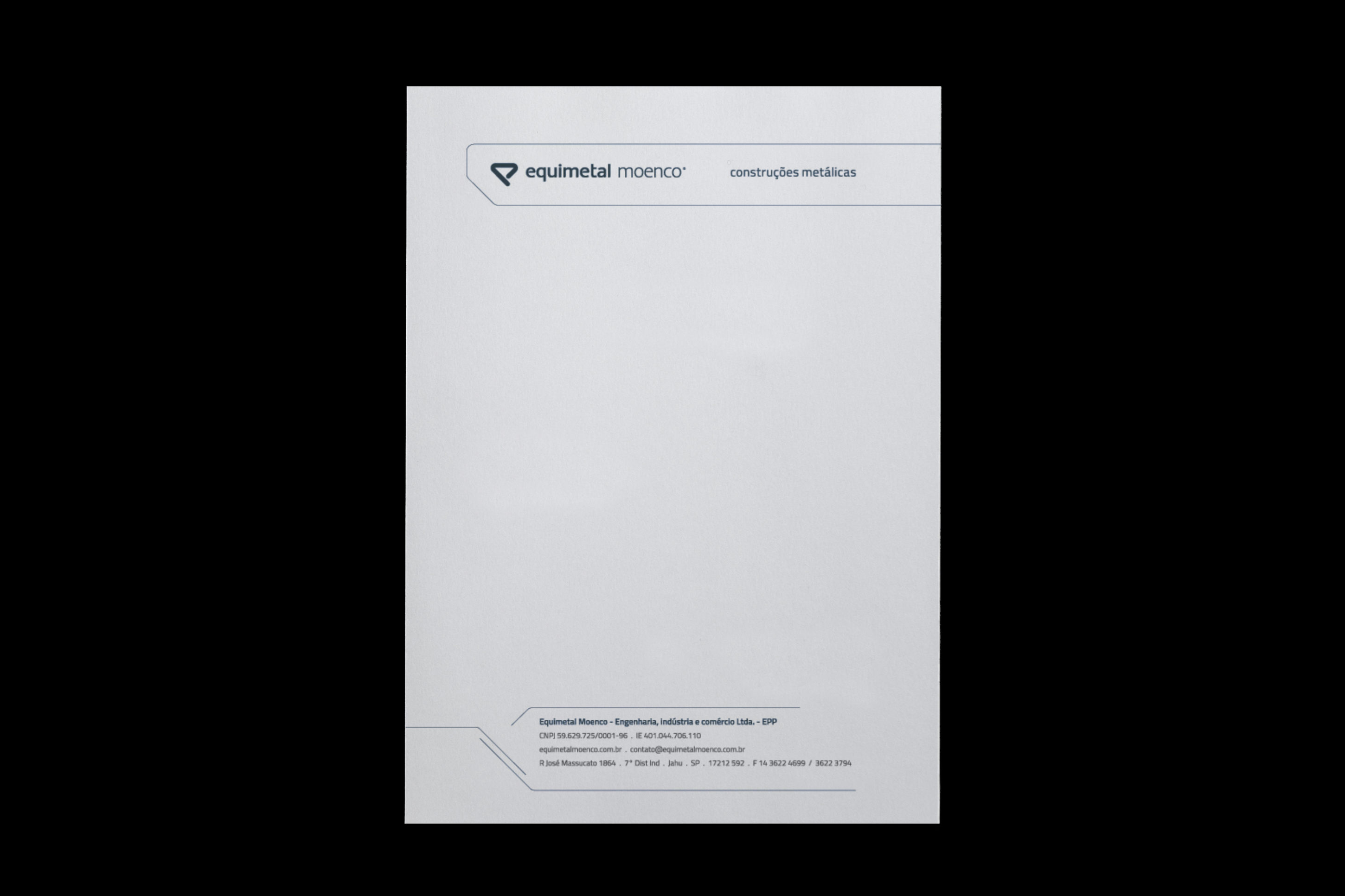
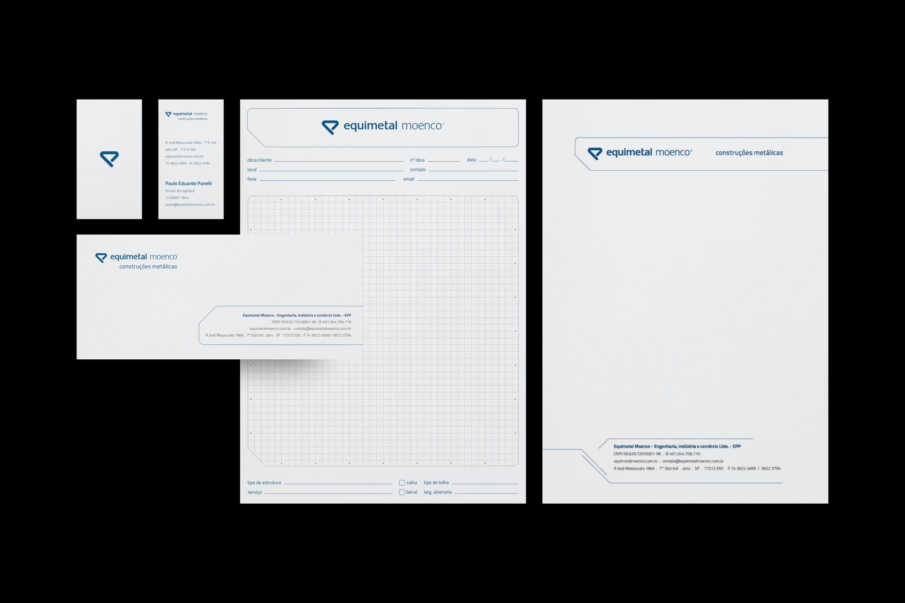
Branding
Branding
Branding
Branding
Branding

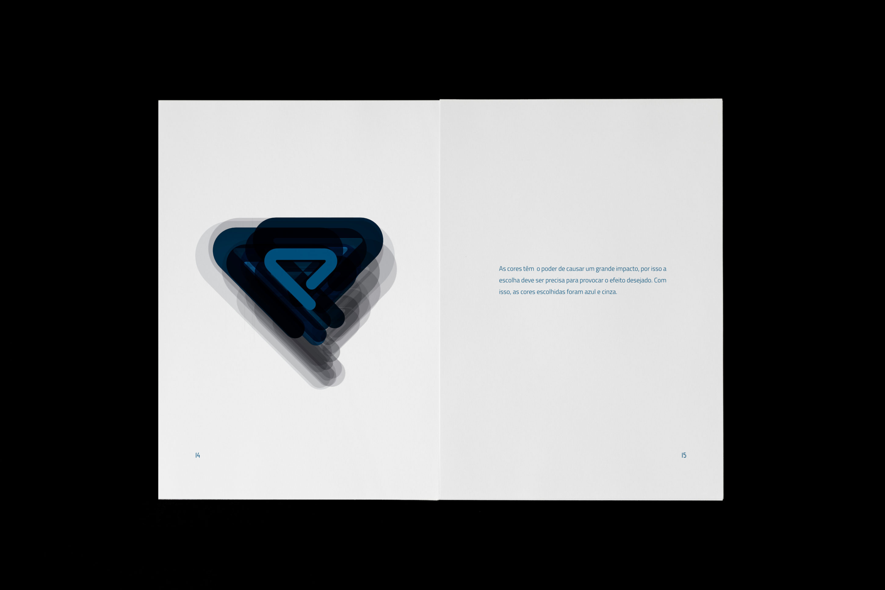
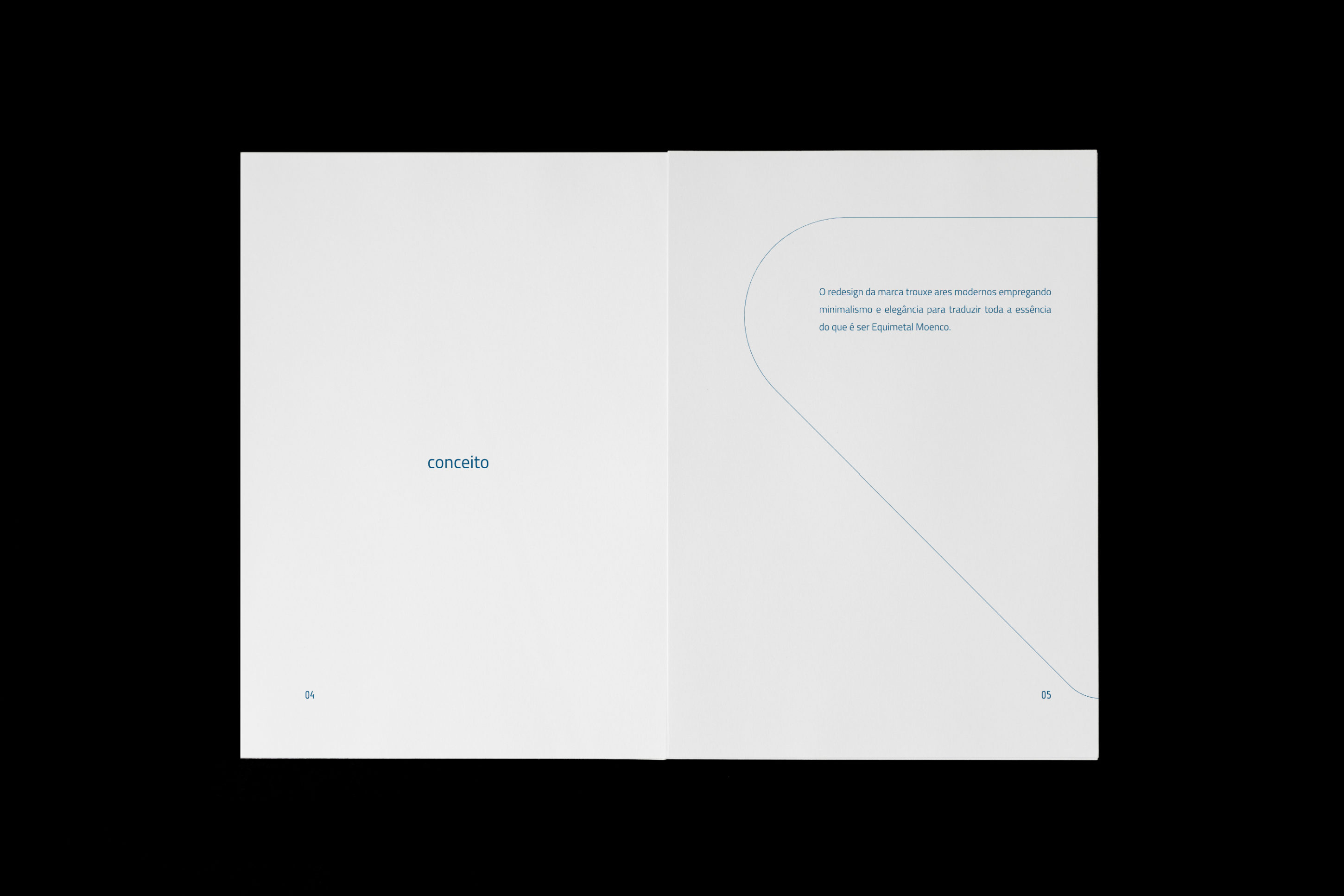
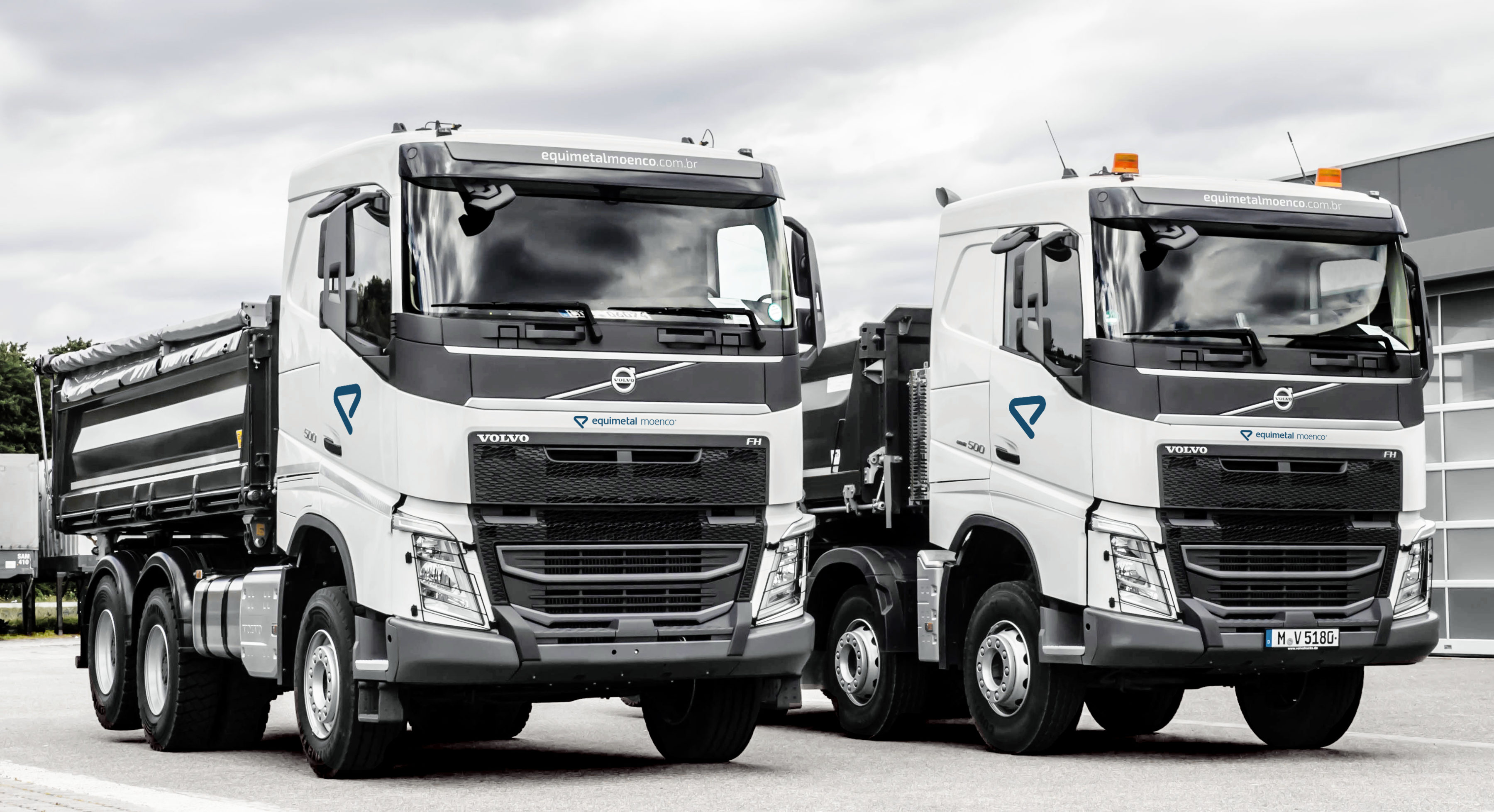
We thoroughly study the universe of each brand to incorporate the relevant elements into the new identity. The palette of colours in blue is one of those historical elements that we brought to the new company aesthetics. Since 2014, the new brand has consolidated in the market. The modern corporate look added credibility for the merger to be viewed positively and the visual identity materials helped to spread the creative concept quickly and efficiently.
Our objective was to implant a unique concept, and we were able to bring together in this project a modern and minimalist design.
Estudamos exaustivamente o universo de cada marca para incorporar os elementos relevantes na nova identidade. A paleta de cores no azul é um desses elementos históricos que trouxemos para a nova cara da empresa. Desde 2014, a nova marca se consolidou no mercado. O visual corporativo moderno agregou credibilidade para que a fusão fosse encarada positivamente, e os materiais da identidade visual ajudaram a espalhar o conceito criativo de uma forma rápida e eficiente.
Nossa meta era implantar um conceito único, e conseguimos reunir neste projeto um design moderno e minimalista.