Equimetal Moenco
The Equimetal Moenco website reflects the new moment of the brand. After creating the new identity, the website became the culmination of all work, introducing the merger to a level of comprehensiveness consistent with its greatness. Our goal was to get away completely from what the metal frame industry was showing, and we did more. By reducing all that was dispensable, the content became clear and logical. Each part had its role well defined.
O website da Equimetal Moenco reflete o novo momento da marca. Depois de criar a nova identidade, o website se tornou o ápice de todo o trabalho, introduzindo a fusão em um nível de abrangência coerente com a sua grandeza. Nosso objetivo era fugir completamente do que a indústria de estruturas metálicas vinha entregando, e fizemos mais. Ao reduzir tudo o que era dispensável, o conteúdo ficou claro, lógico. Cada parte tinha o seu papel bem definido.
Web
Web
Web
Web
Web
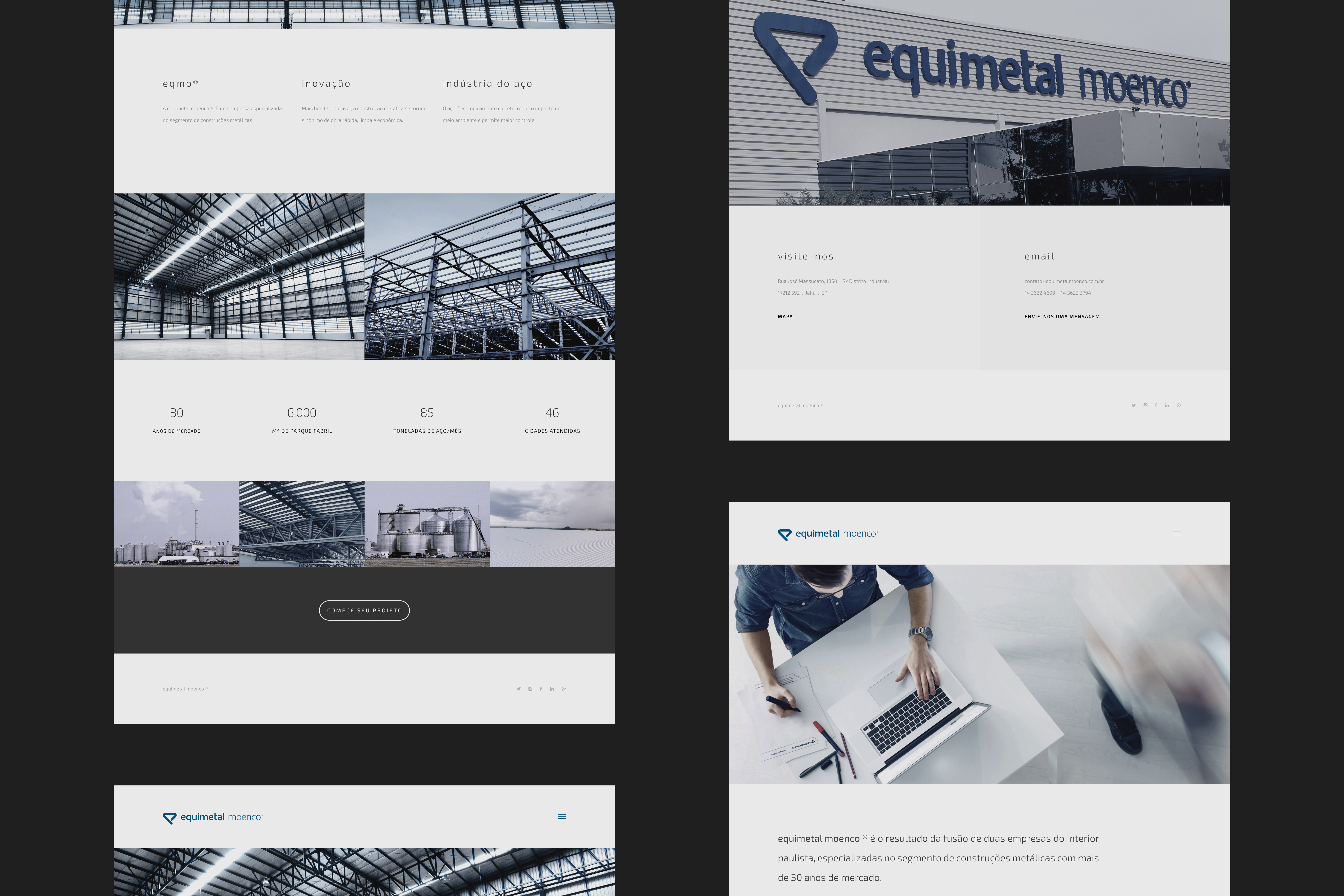

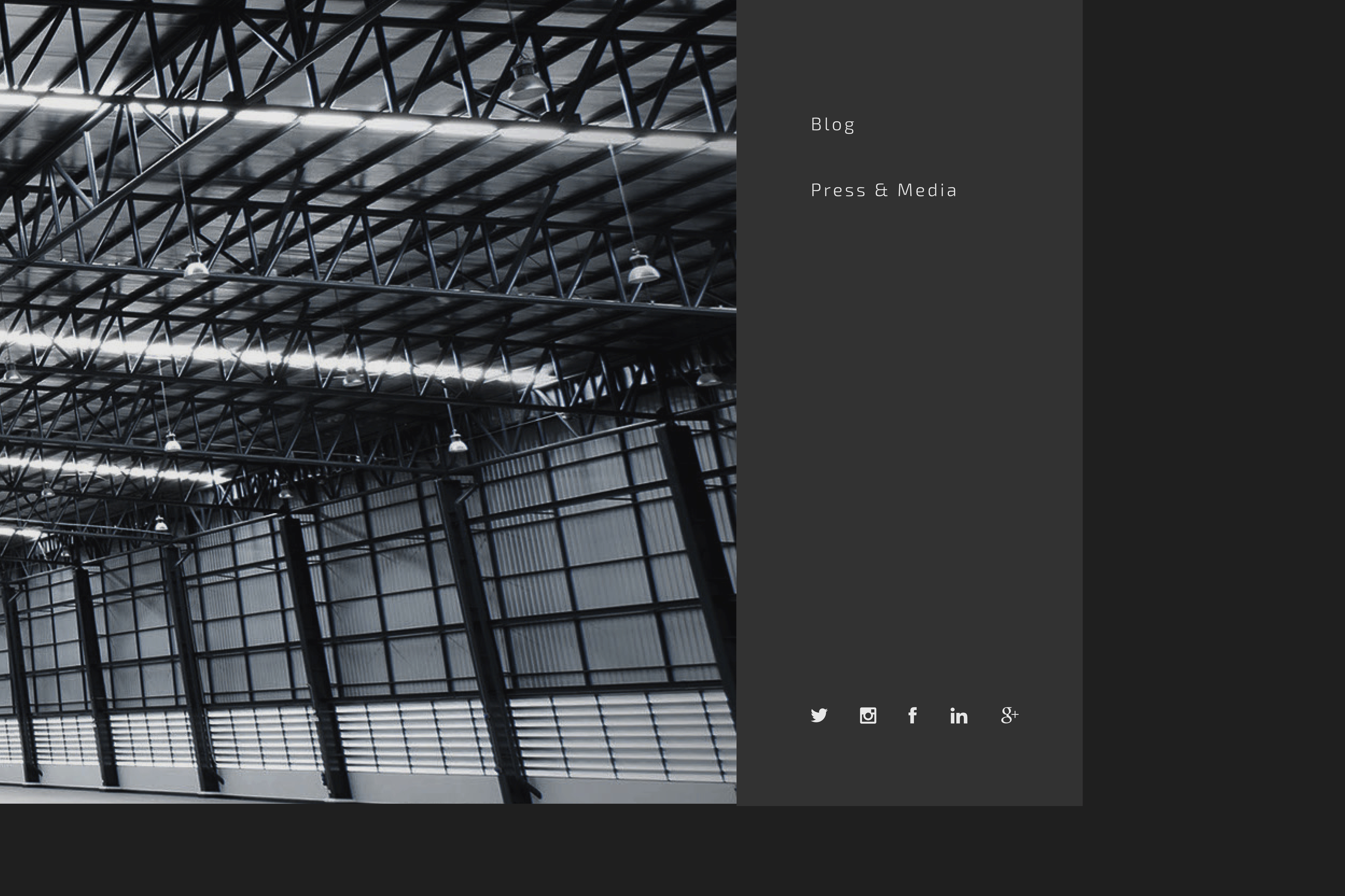
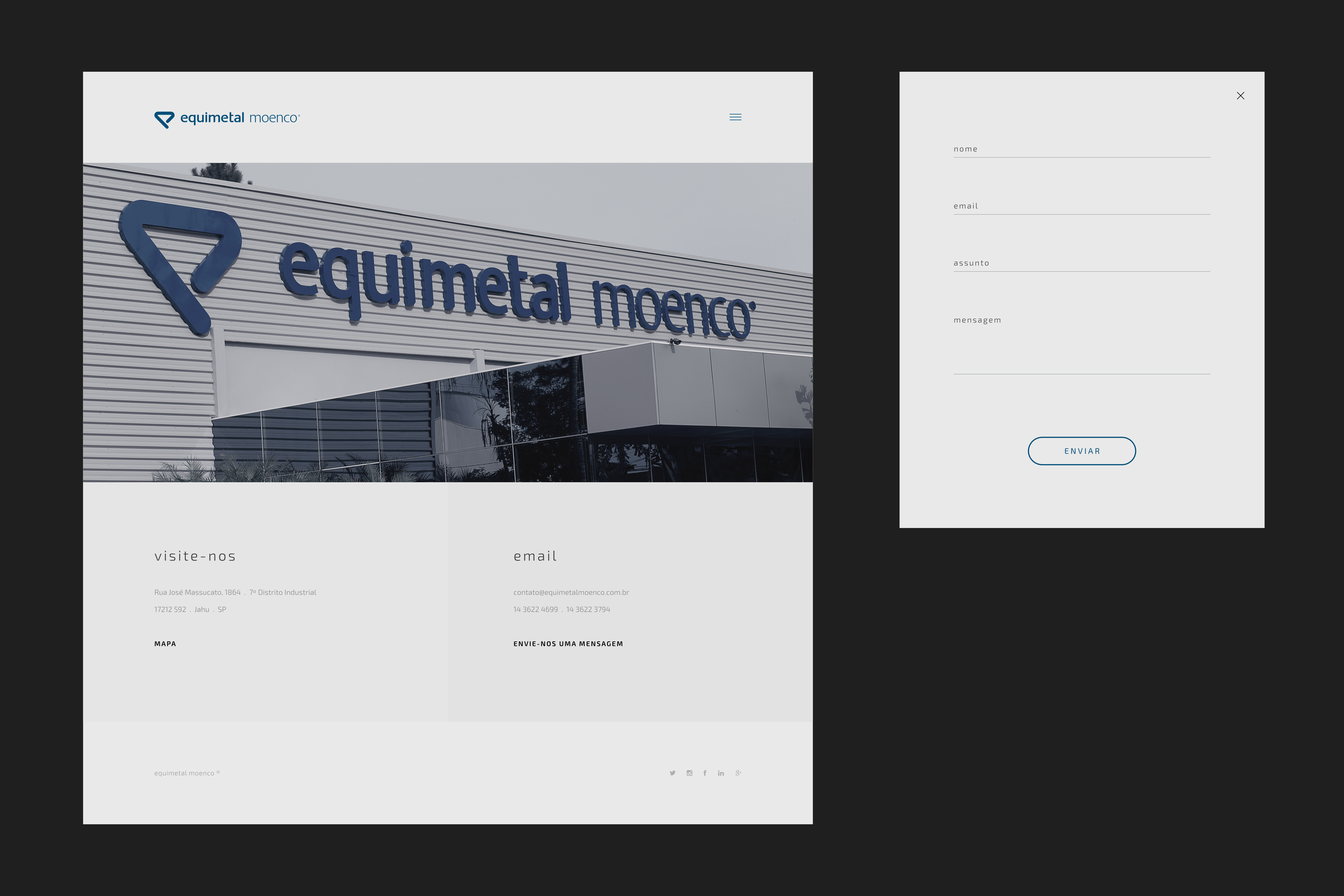
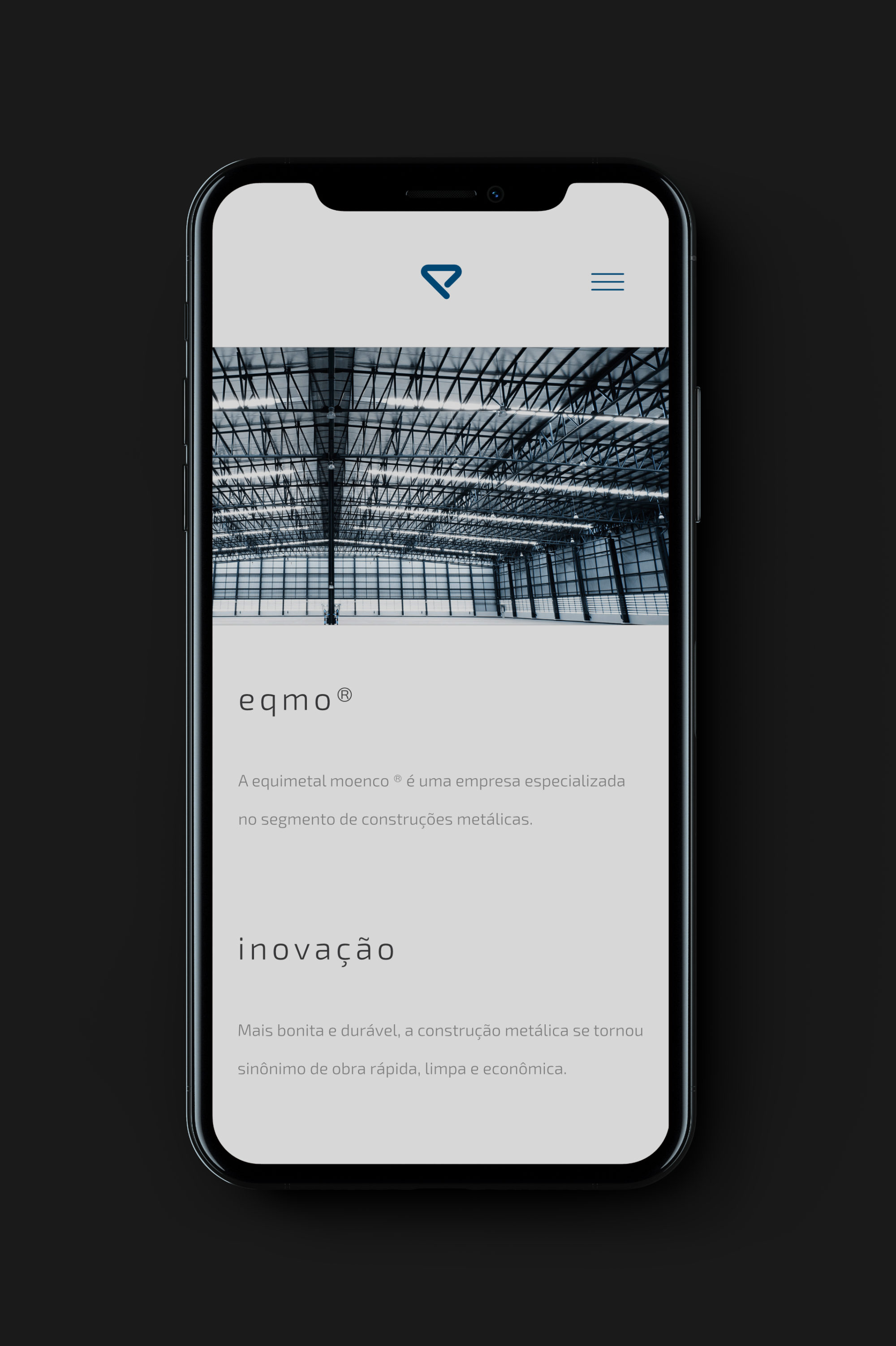
Creating an institutional website for a recent merger entails extreme care as to how this brand will be evident. We use the colour palette punctually, with emphasis on white and on graphite menu. Thus, the blue of the logo would be marked by the impact of the first glance. The simple and objective language has brought the almost 30-year-old mark to the current times of the web, which does not consume long content, which explains the minimalist aesthetics present on every page.
Criar um website institucional para uma fusão recente implica cuidado extremo com o quanto essa marca será evidente. Nós utilizamos a paleta de cores pontualmente, dando ênfase no branco e no menu grafite. Assim, o azul do logo seria marcado pelo impacto do primeiro olhar. A linguagem simples e objetiva aproximou a marca de quase 30 anos para os tempos atuais da web, que não consome conteúdo longo, o que explica a estética minimalista presente em todas as páginas.
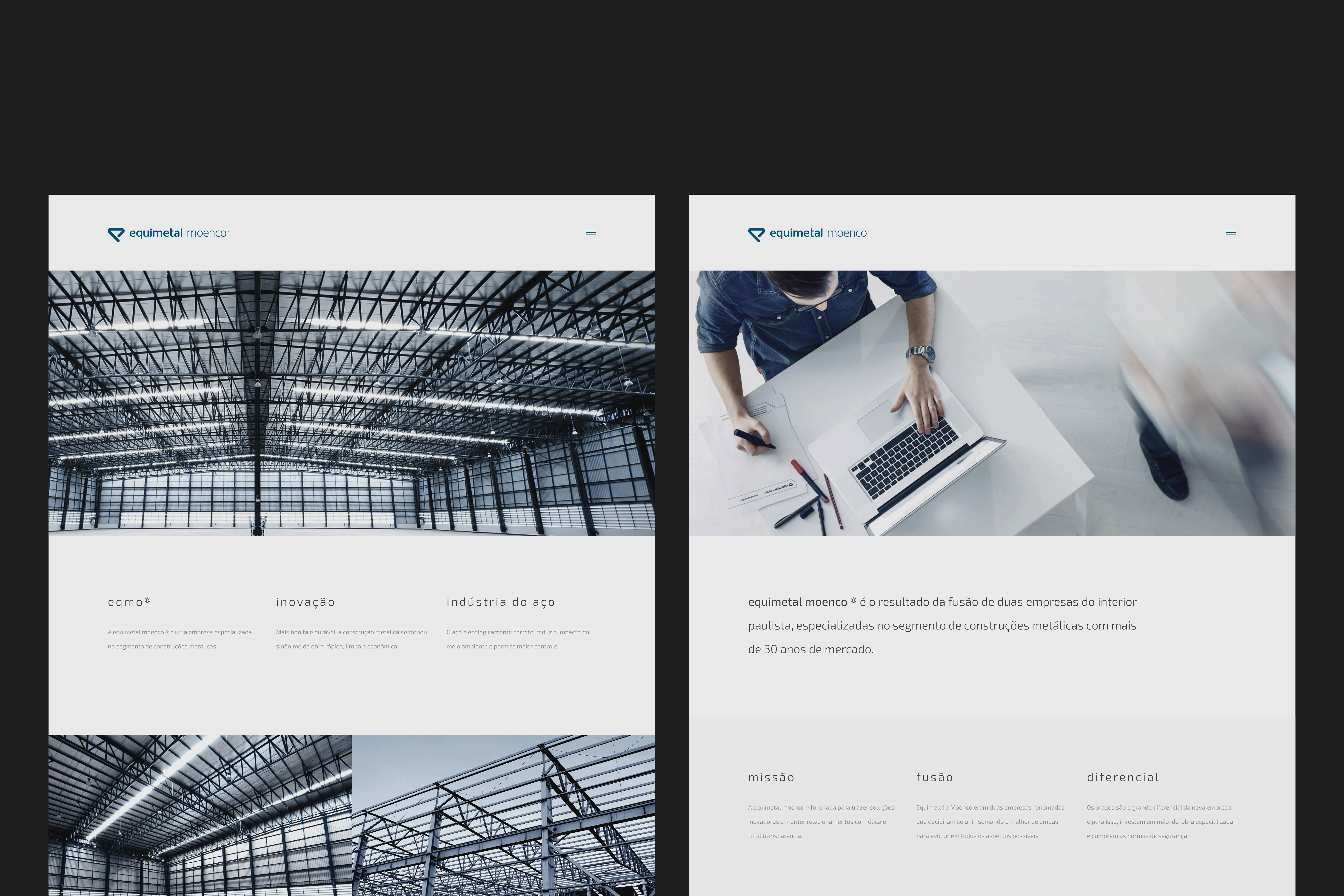
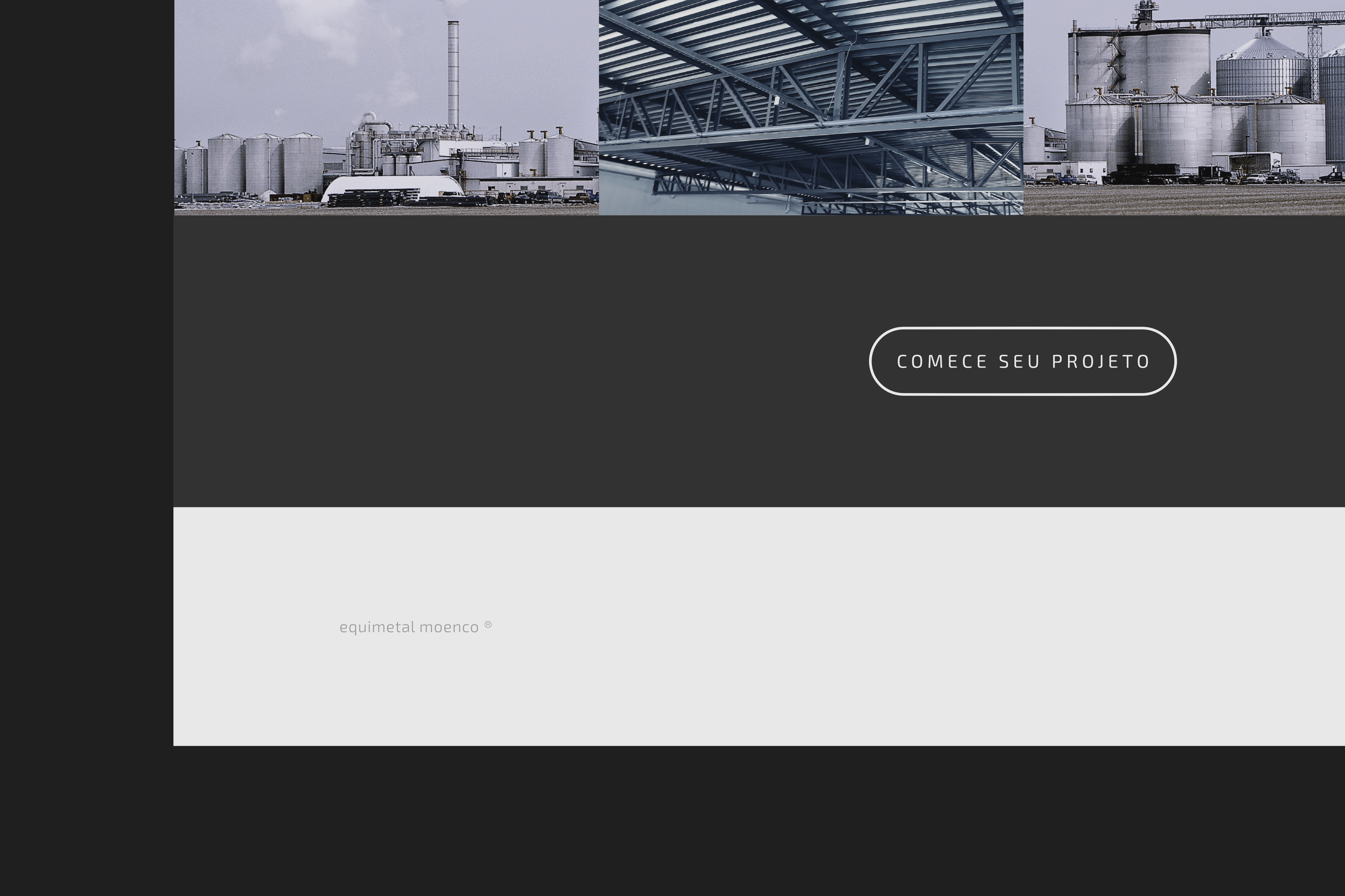
We deliver an innovative concept on this website, an entire space for the new brand to be understood institutionally. We value the beauty of the form and we present all that Equimetal Moenco is in a dynamic way. The adjustment of the website is friendly and was one of the principles we did not give up, everything needs to be beautiful wherever it is. In this way, the project emphasized the new brand, for the simplicity that this minimalist aesthetic has achieved.
Nós entregamos um conceito inovador neste website, um espaço inteiro para a nova marca ser entendida institucionalmente. Valorizamos a beleza da forma e apresentamos tudo o que a Equimetal Moenco é de uma forma dinâmica. A responsividade do website é amigável e foi um dos princípios que não abrimos mão, tudo precisa estar bonito onde quer que esteja. Desta forma o projeto enfatizou a nova marca, pela simplicidade que esta estética minimalista alcançou.